Plane- flat: having a surface without slope, tilt in which no part is higher or lower than another; A flat surface extending infinitely in all directions (e.g. horizontal or vertical plane).
Edge- the outside limit of an object or area or surface; a place farthest away from the center of something.
Alter Ego- An alter ego (Latin, "the other I") is a second self, a second personality or persona within a person. It was coined in the early nineteenth century when schizophrenia was first described by early psychologists. A person with an alter ego is said to lead a double life.
Abstract- not representing or imitating external reality or the objects of nature.
Non-Representational- non-representational art is art which is not based on external appearances; this covers several types of art - abstract, and non-objective; work which encompasses non-recognizable imagery that varies from pure abstraction.
Anthropomorphic abstraction- showing human form or characteristics to a being or thing not human
Geometric abstraction- a form of abstract art based on the use of geometric forms sometimes, though not always, placed in non-illusionistic space and combined into non-objective (non-representational) compositions.
Mask- an article normally worn on the face, typically for protection, concealment, performance, or amusement.
Low relief- three-dimensional form that is barely raised from a flat surface.
High relief- three dimensional form raised considerable off a flat background.
In-the-round- a sculpture that can be viewed from all angle
Wednesday, February 10, 2010
Wednesday, February 3, 2010
Wood Sculpture- Arrow
The objective of this assignment was to purchase 2" x 2"s and create a piece that confronts linear space but I could only make 7 cuts. I had to think of the presence and absence in space, opened and closed space, and proximity (definitions in earlier blog).
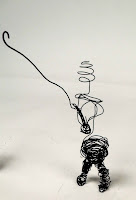
Wire Sculptures- Fisherman
Wednesday, January 27, 2010
II. Line and Space
Straight line- a line traced by a point traveling in a constant direction; a line of zero curvature
Mark Di Suvero, Clock Knot
Leonardo Drew, Number 123
Mark Di Suvero, Old Buddy (For Rosko)
Curved line- The curve of a line can convey energy. Soft, shallow curves recall the curves of the human body and often have a pleasing, sensual quality and a softening effect on the composition.
Jean Tinguely, Meta-Matic No. 10
Mark Di Suvero, Bojangles
Jean Tinguely, Meta-Matic No. 17
Mark Di Suvero, Tire Chair
Vertical line- often communicate a sense of height because they are perpendicular to the earth, extending upwards toward the sky.
Horizontal line- suggest a feeling of rest or repose because objects parallel to the earth are at rest. In a landscape, horizontal lines also help give a sense of space. The lines delineate sections of the landscape, which recede into space. They also imply continuation of the landscape beyond the picture plane to the left and right.
Diagonal line- convey a feeling of movement. Objects in a diagonal position are unstable. Because they are neither vertical nor horizontal, they are either about to fall or are already in motion.
Actual line- lines that are physical present in a design
Implied line- are those that are suggested by the positions of shapes or objects, where as actual lines are physically present.
Sight line- straight lines that have no obstructions
Space- There are two different types of space negative and positive. Positive space is the space taken up by something in an area, and negative space is the space around something in an area. Space is the creation of visual perspective, which gives the illusion of depth.
Presence in Space- refers to the existence in the space around or in an object.
Absence in Space- space that is not fully occupied, or filled to its potential.
Opened Space- refers to space that is not completely enclosed by a line. When properly done the space will act as an environment instead of an end to the piece.
Closed Space- any shape/space completely closed by a line.
Kinetic Form- a movable sculpture
Proximity- a Gestalt principle of organization holding that (other things being equal) objects or events that are near to one another (in space or time) are perceived as belonging together as a unit
Closure- a Gestalt principle of organization holding that there is an innate tendency to perceive incomplete objects as complete and to close or fill gaps and to perceive asymmetric stimuli as symmetric.
Wednesday, January 13, 2010
I. Elements of 3D Design
Symmetrical balance is seen in perfectly centered compositions or those with mirror images. In a design with only two elements they would be almost identical or have nearly the same visual mass.
Brancusi, The Kiss
Judy Chicago, Birth Project
Magdalena Abakanaowicz
Felix Gonzalez-Torres, Untitled (Perfect Lovers)
Louise Bourgeois, Janus Fleuri
Asymmetrical balance is the placement of non-identical forms to either side of a balancing point in such a way that the two sides seem to be of the same visual weight.
Michelangelo Pistoletto, Silver Self-Portrait
Donald Judd
Richard Serra, Bramme
Claes Oldenburg, Spoonbridge and Cherry
Claes Oldenburg, Spitzhacke
Radial balance is an organized pattern or design emanating from the center of a circular format. This design usually has some symmetrical properties.
Brancusi, The Table of Silence
Judy Chicago, Holocaust Project
Nam June Paik
Claes Oldenburg, Ice Bag-Scale B
Eva Hesse
Scale is a ratio that is used to determine the relationship between an object represented to that which it represents in its actual size,
Proportion is the harmonious relationship of one part to another or to the whole with respect to size, quantity, or degree.
Brancusi
Judy Chicago, Minimal works
Michelangelo Pistoletto, The Rooms
Felix Gonzalez-Torres, Untitled (Silent Majority)
Louise Bourgeois, American
Emphasis is the principle of design by which the artist may use opposing sizes and/or shapes, contrasting colors, or other means to place greater attention on certain areas or objects in a work of art,
Contrast is the difference in visual properties that makes an object (or its representation in an image) distinguishable from other objects and the background.Magdalena Abakanowicz
Eva Hesse, Free Study with leaves
Eva Hesse, Augment
Michelangelo Pistoletto, Experiment
Felix Gonzalez-Torres, Untitled (Portrait of Ross in LA)
Variety is a principle of design that refers to combining different elements of art to achieve different visual interest.
Repetition is a technique used in which a design, shape, or line is repeated for effect or emphasis,
Rhythm refers to the repetition of a design, shape, or line that creates the visual aspect of movement. Eva Hesse, Schema
Magdalena Abakanowicz, Katarsis (33 figures)
Nam June Paik, Moon is the oldest television
Leonardo Drew
Louise Bourgeois, Echo
Subscribe to:
Posts (Atom)